

For years I have ̶c̶o̶m̶p̶l̶a̶i̶n̶e̶d̶ suggested that my wife walks too fast. I finally found the data to prove it.*
Many a time have I been fooled into joining my wonderful wife on an ostensibly relaxing stroll, only to find her pace anything but leisurely (especially when her pre-ordered coffee awaits on some Starbucks counter). I’ve often remarked that she’s walking way too fast for the casual meander that I was led to believe we were on. She humors me and slows down, but within minutes we have returned to our breakneck pace.
Or at least, that’s how I recall these situations. But is all that in my head? Does she actually walk faster than me? Is there any data that could help answer these inconsequential and trivial questions?
How Google fit proved me right
Enter data from Google Fit, a free app that has been passively estimating my activities based on the phone’s sensors since at least 2018. Among various metrics it captures are the step count and distance of my movements. Based on those two values, I can calculate the average distance per step (or “step length”) on any given day.
Studies show that as speed increases, step length does as well. So (setting aside how pathetic I am for researching that in order to win an argument that really isn’t an argument and can’t really have any winner), if my step length increases during time periods when I do more activities together with my wife, then it’s reasonable to interpret that we walk faster together.
The data has spoken.
This chart shows my average step length (in inches) every day between August 2018 and May 2020. The orange trendline shoes that my step length has increased by 47%:
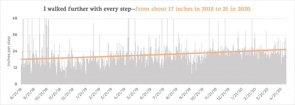
Keep in mind that the data (by coincidence) begins in summer 2018 — almost exactly when my wife (then fiancé) and I moved in together after living on opposite coasts. So it does a decent job illustrating my movements under her influence.
A flawed analysis
* You’ll notice a big asterisk in this post’s subtitle. That’s because there are many reasons why this could be a useless analysis that likely proves nothing:
- Although the timeline begins right about when we moved in together, having earlier data — from when I lived (and walked) alone — would provide a control to compare this trend against.
- All this shows is that my increased step length is correlated to a time period when I likely walked more with my wife. It does not prove any causation, but that won’t stop me from pretending it does.
- It is possible that my devices’ sensors improved in quality. The trendline could really just reflect the phone getting more accurate readings over time while my step length stayed the same.
- Despite the science I referenced above, it is possible that step length might not be associated with speed. This study suggests that steps per second would be a better signal.
- The data source itself is a bit unreliable and noisy. For example, in the chart you can see many days when I apparently took 3ft+ steps, which of course isn’t the case. That said, the volume of data (622 day records, each calculated using 96 daily observations) makes it possible for reasonable insights in aggregate. For example, my average step length across the 21-month period is about 23 inches, which is just shy of average. That offers some reassurance about the reliability of this data.
Those caveats aside, this exercise serves as a reminder about how the everyday data that we produce can provide unique insight into our personal patterns and even relationships.
Under the hood
I exported the Google Fit data using Google Takeout and analyzed the Daily Summaries CSV file in Excel to produce and design the chart above.
I used Dall-E to generate the cover art using AI and the prompt “two sets of footprint tracks in sand, pastel painting, moody colors”.