Got places to be? Here’s a summary deck.
Keep reading at your own peril.
At A Glance
Key Insights
TikTok first became my most-used app in August 2021, within nine months of being downloaded—while news and social apps like SmartNews and Reddit declined steadily.
Half of my day (50%) is spent either sleeping or on my phone. I average 7 hours and 15 minutes of sleep each night.
I checked my phone 74,000 times over a two-year period. That’s about 100 times per day.
DATA SNAPSHOT
This data source includes 8 different datasets summarizing my activity, usage, notification, location, and check device history.
The largest dataset includes nearly 600k records and over 1 million observations.
I used App Usage (Android) to track and export my activity from July 2020 to Jun 2022.
Why This Matters
How we use our phones reflects our priorities, ambitions, values, and vices. This project unearths my digital and real-life behaviors from my phone usage history.
We all regularly share these insights with advertisers, device manufacturers, and mobile operators—but what if we peek into our own data ourselves? What insights about our priorities, interests, social life, or even health can our phone usage history reveal?
For example, my own phone history possesses patterns that reaffirm my suspicions (I really do receive too many WhatsApp notifications), expose concerns (my TikTok usage is growing exponentially) and even allay my fears (I spend less-than-average time on my phone).
Will I use these insights to change my behavior? Probably not. Maybe. Are they fascinating regardless? You be the judge. (but say yes pls)
Insights
How much time do I spend on my phone?
I spent 4 hours and 23 minutes on my phone each day. That’s 25 minutes short of average, according to this study:
I’m surprised by the weekly variance in the number of hours I spend on my phone. Also mildly concerned to see my daily use trending slowly up over this two-year period.
How often do I receive notifications?
I averaged 226 notifications every day—that’s one every fifteen minutes of my entire life. Fortunately, it seems that the daily notification count is slowly declining over time:
42% of all my notifications came from WhatsApp. That’s over 69k messages in two years, or about 96 per day (the actual number of messages is a bit lower, since WhatsApp also notifies about activities like backups. But the vast majority are messages.)
Not all apps notify me equally. This chart shows how notifications from different apps are distributed across the 24-hour day (starting at 12:01am). I’ve highlighted the Camera app—can you guess why it’s so evenly distributed, even in the early hours of the day?
So many insights to unpack in there, like:
- My camera app notifies me at all hours. This is probably because I get a notification every time I snap a pic, and I use the app most heavily when traveling (including in other time zones, which could explain the relatively high share in the early hours)
- There’s really no window, even in the early hours of day, when I’m not being notified by Gmail.
- The Doorbell app notifies me whenever someone approaches or leaves our front door, which is generally during business hours and gradually tapers off after 6pm.
- Google notifies me in chunks throughout the day. I think this reflects my settings to receive notifications every half-hour.
The number of times I check my phone, the number of notifications I received, and the amount of time I used my phone were all positively correlated with each other. This is intuitive, but it also could suggest that, if I want to reduce my phone time, I could limit my notifications in my apps ‘ settings (this is just a hypothesis):
How much sleep do I get?
I sleep on average 7 hours 15 minutes each night. That’s actually remarkably close to my target of 8 hours.
This is one of my favorite metrics, but it’s also imperfect since I had to approximate the data—read the footnote for details:
“Everything else” in the light-grey area at the top is any time I wasn’t on my phone or sleeping. That turns out to be almost exactly 50% the time. It’s striking to think that half of my life is spent sleeping or on the phone.
I get the most sleep on Sundays:
A closer look at the distribution reveals some telling patterns. In this chart, each dot represents a specific day (about 580 observations). The box shows the spread between the 25th and 75th percentiles. The spread on Wednesday and Thursdays is narrower than other days, suggesting that I sleep more consistently and with less variation on those midweek days, compared to weekends when there is more variation.
Which apps do I spend the most time on?
I spent nearly 21 hours per month using Chrome—more than any other app. But that’s likely going to change soon. This chart features my top ten most-used apps:
My next-most popular app is TikTok, at 16.5 hours per month. That works out to about half an hour a day, which honestly is way less than I’d feared. Still, it’s remarkable to see how quickly TikTok has grown to be one of my favorite apps, seemingly at the expense of news and social apps like SmartNews, Reddit, and Instagram. This chart reveals a strong correlation between when I installed TikTok in late 2020 and when these apps’ usage started declining:
This race chart of my ten most-used apps illuminates how quickly TikTok overtook several of my most-used apps:
There are different ways to define “use”. This scatter plot shows how there isn’t a clear correlation between the number of times I accessed an app and how long I use that app. This chart shows only the ~150 apps that I accessed more than 50 times during the two-year period.
When do I use different apps?
A heatmap of my use across different apps reveals some insightful patterns about my life. For example, I’m most likely to go running (using my running app) in the afternoons, stream soccer games in the afternoon (during the European Champions League games), and read news or network on LinkedIn in the mornings.
It’s also fascinating to see how different features in similar apps inform my use. Netflix allows users to download videos to watch offline, which might explain why I use it more at all hours of the day than Hulu: I’m watching from a plane or country in a different time zone.
This chart shows how I long I use my ten most-used apps on each day of the week. Sunday is usually the day I use each app the most, but there are some exceptions like Google Maps, which I use more on Saturdays.
Methods and Data Source
I gathered this data using an Android app called App Usage. The paid version is $3.99/year, which I’ve paid since April 2020.
The app has an “Export CSV” feature which lets you select one of 9 dimensions (like “usage” or “activity”) and a custom time period of up to three years. I exported a CSV for each dimension (except “battery history”, which displayed a blank file) for July 1 2020—June 30 2022, or exactly 2 years.
The resulting 8 CSV files come neat and clean, so I jumped straight into Excel to combine, munge, and analyze the files to produce the data highlighted in this post. Next time, I’d like to run these analyses in python, so that I can easily update this research with new data in the future, and share the analyses via a Jupyter notebook.
I used Flourish to design and publish all charts for free.
There are some limitations that should inform any interpretation of this data:
- It appears that all times are recorded in local time, not using a consistent standard like UTC.
- The time period covered in these insights overlap with the COVID pandemic, when everyone’s digital behaviors changed seismically. I wish I had data from before the pandemic, to explore how it affected my digital habits.
- I use a separate smartphone for work whose data is not included here. I do a pretty good job keeping out of personal stuff on that device, so this dataset is a decent representation of everything I do on mobile devices.
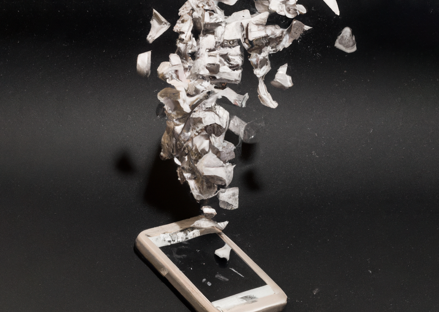
I generated the cover art using Open AI’s image generation tool Dall-E and the prompt: “an origami phone unravels into millions of small pieces of dust, black background“.

